...

Trringo. Transforming the rental tractor business in rural India

  • Client Mahindra Tractors
  • Platform Android App
  • My Role Lead Research and Interaction Design

TLDR; or the project in a nutshell

Project Overview: An 'Uber for Tractors'?

Unlike developed countries, many farmers in India do not own tractors. Usually, a few tractor owners rent out their tractors to farmers in their village based on a first-come, first-serve basis— these local ecosystems are a result of interpersonal relationships.

Our client, Mahindra Tractors, realized that an aggregator platform could help in bringing down the rental cost of the tractor by increasing competition and availability, quite similar to what Uber did for the cab market. As part of this initiative, the client invited us to design an app to connect the tractor drivers and farmers who rent their services. The app also supports the native languages of the five states, where this project is active. https://www.trringo.com

As the lead UX designer for this project, I was responsible for:

  • Conducting secondary research to understand the domain.

  • Conducting a stakeholder workshop to understand the client's requirements and coalesce them into a guiding problem statement.

  • Conducting field research to validate our hypothesis and come up with insights about users.

  • Making wireframes to test with a limited set of tractor drivers (primary user).

  • Working with the visual designer to create a visual language for the app.

Secondary Research: Understanding the domain

Before meeting the client who is based in the city of Mumbai, I referred to research reports published on the Indian agriculture by organizations such as the Food and Agricultural Organization (FAO), Reserve Bank of Australia (RBA), etc. (Links mentioned at the end). Some of the key findings were:

  • Since independence, there was a tendency for an original family holding to be progressively subdivided, a situation that continued in the early 1990s. This phenomenon resulted in many landholdings (82% of total farmers are the owner of smallholdings). Smallholding farmers are the most efficient and favor mechanization and hence the renting of farm equipment (FAO Report).

  • Tractors are now considered to be a production machine and an investment and used extensively for agriculture and other purposes by renting them out.

  • Gross underutilization of tractors among medium and large farmers, renting business can mitigate this.

  • Contract farming can encourage mechanization as the crops grown under this agreement are new, more amenable to mechanization and come with good agricultural practices which cut costs or raise yields and productivity (IASRI, 2006)

This is a caption on this photo for reference

Field Research: Understanding the client needs and defining the problem

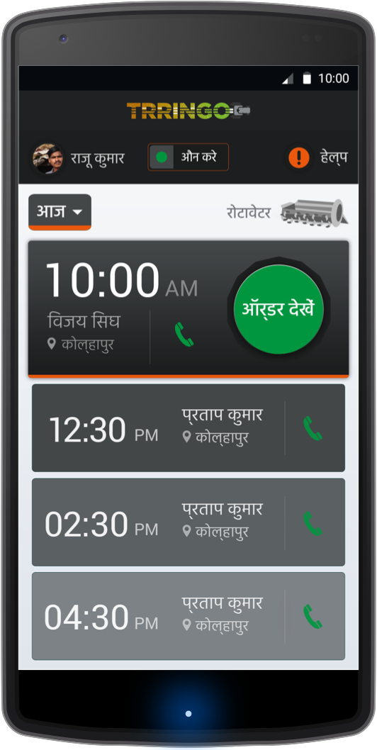
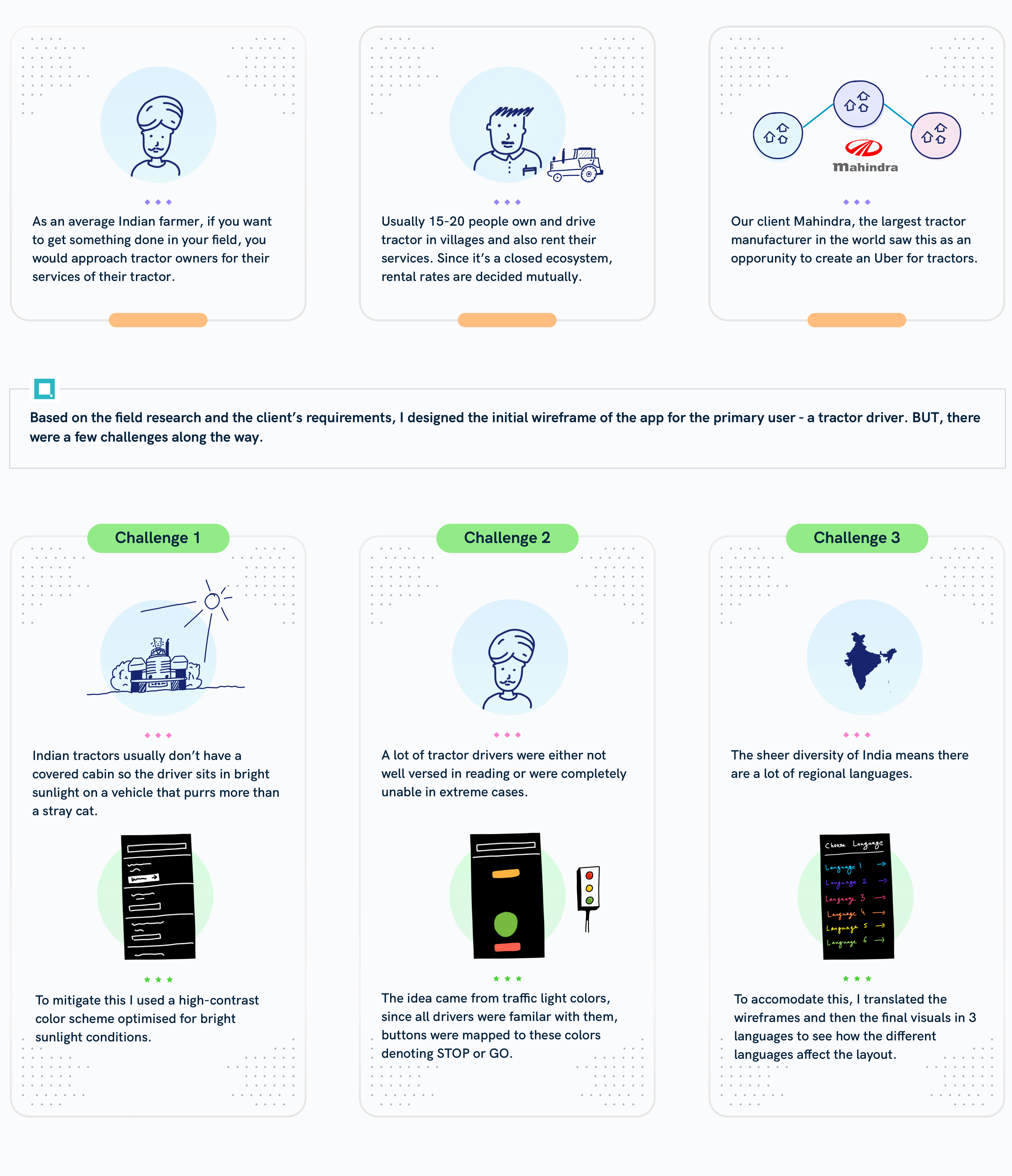
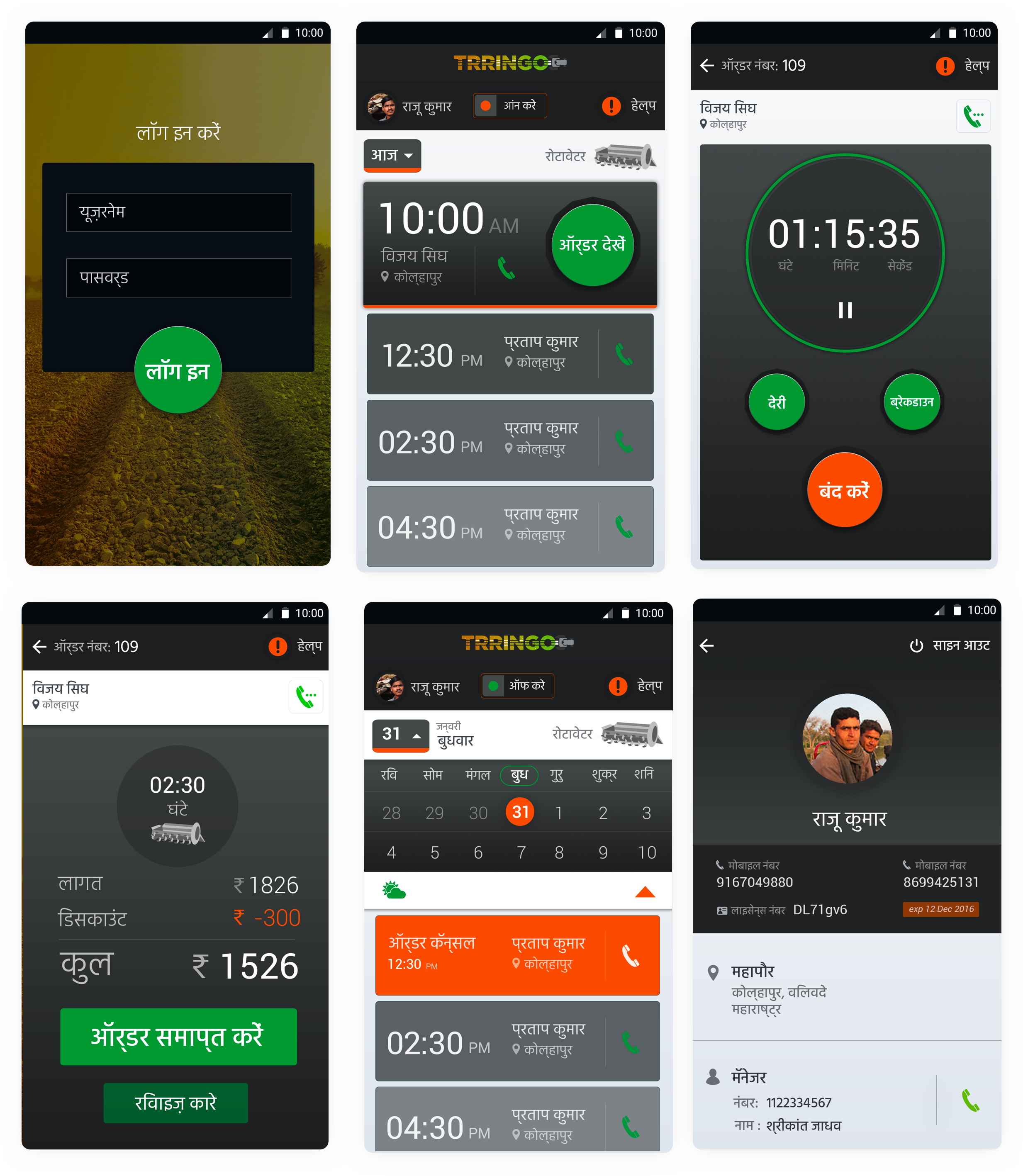
After meeting the stakeholders, I was informed that they had an existing app for tractor drivers, but it had usability issues. As a result, drivers were unable to use it. My primary task was to create an app that was easy enough to be used by tractor drivers with varying levels of ease with smartphone use. The biggest constraint with this project was a short timeline as this whole project was a proof of concept, and the client didn't have enough time for field research and iterations.

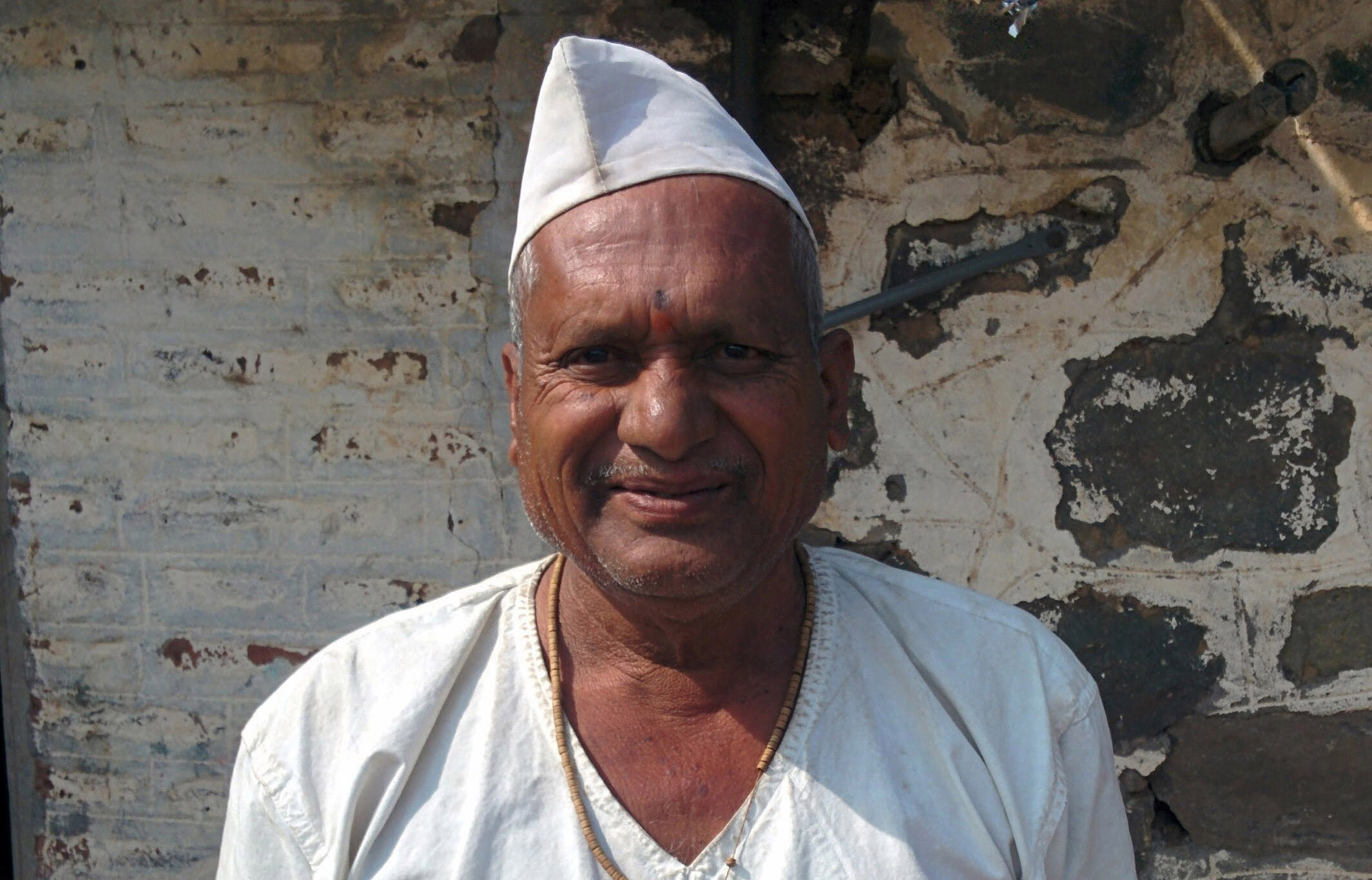
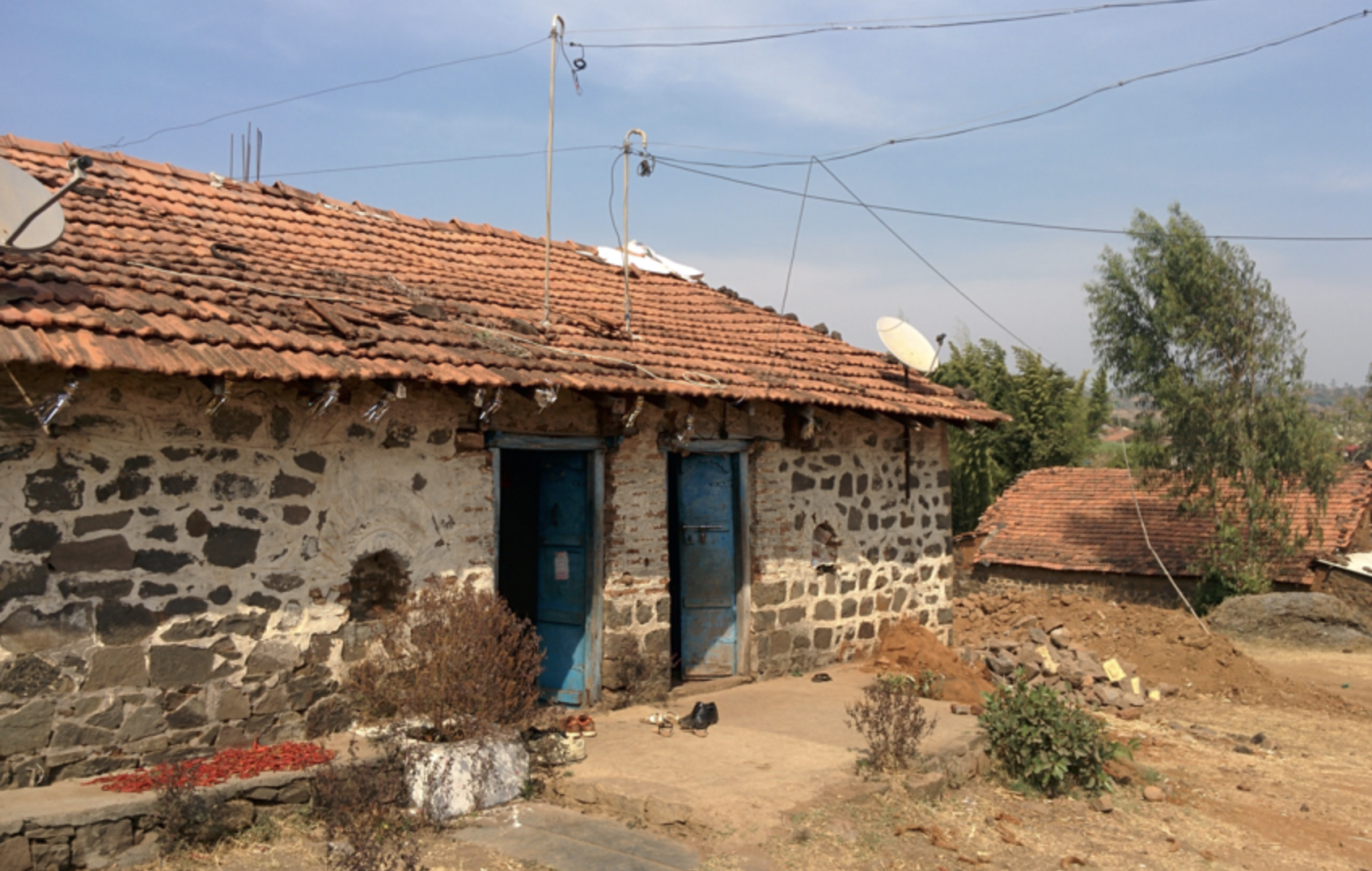
To accomplish this, we embarked on field research in a small village 1600 KM away in the state of Maharashtra, where the client had a pilot set up with a few tractor drivers. Some of the salient findings were:

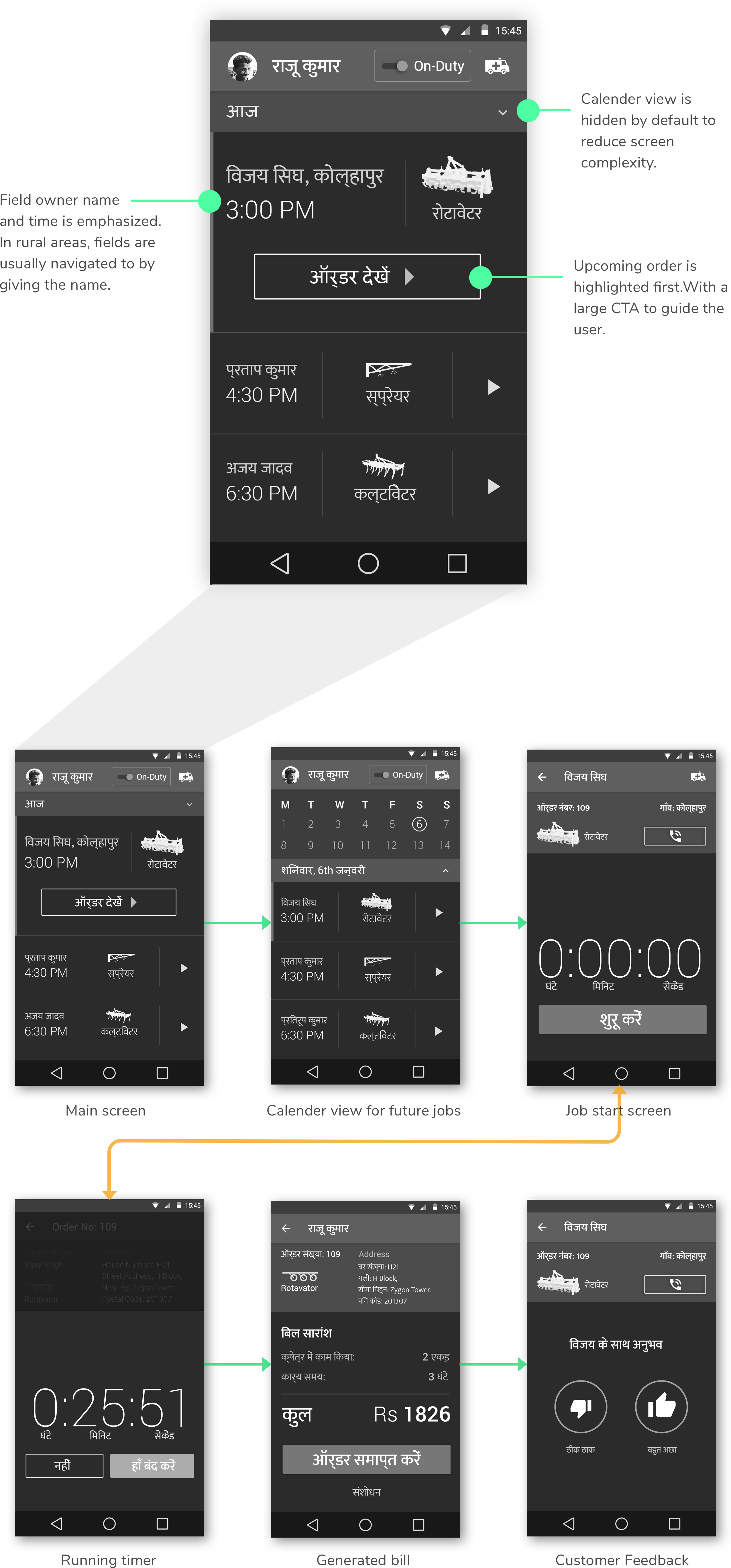
  • Drivers were familiar with 'WhatsApp.' A popular messaging application.

  • Map-based UIs were not useful at all in villages.

  • Only 32% of the drivers reported on-time.

  • Most of drivers were unclear about the nature of jobs.

Additional Observations:

  • Bright sunlight conditions: While talking to the drivers and tractor owners during field research, I realized that they spend most of their time under the sun as most tractors sold in India are open-air tractors.

  • Excessive vibrations: Tractors vibrate a lot, and as a result, it's hard to read text on a screen.

...

Concept and Evaluation

To cater to our primary persona,I came up with two concepts, one chat-based and the other task-based. To evaluate the concepts, I organized another co-design session with the stakeholder, where we decided against the chat-based concept because:

  • A chat-based application makes it difficult to navigate to previous jobs.

  • Integrating a calendar for viewing the schedule into a chat interface would make it complicated to use, nullifying the reasonfor its consideration.

  • The client's development team was not comfortable with developing a chat-based interface in the limited amount of time.

...

Wireframe Prototype: Grounding the findings

Highlight the upcoming job: show what the job is, where is it, and what the driver is supposed to do to prepare for it.

  • The wireframes highlight the upcoming job and driver's schedule for the day and later. The driver can also see past jobs by scrolling up. For planning their month, they can use the calendar functionality. To show this visually, the CTA to start the next job is shown by default along with the location.

  • Just like Uber, the driver can come online to indicate they are ready to accept jobs.

  • The field research showed that the kind of attachment for a job is quite important; as a result, I added images to the jobs to show the attachment type required.

  • Since the app was to be used in 5 different states of India, each having a unique language, I created five versions of the wireframes to test that.

  • The driver can access a profile section to update details about their license and phone number. They can also see the details of their manager in this section.

  • My initial proposal included an onboarding experience to explain the functionality of the app and to choose the language. However, it was not included in the wireframes as the client decided to conduct onboarding at their hubs.

...
...

User Testing: Validating the assumptions

Unlike standard user testing, we did not screen our participants and tested our prototype by first introducing the project and its intent and then the primary flow. Most of our testing sessions were unstructured interviews; however, I learned that in most cases, one attachment is suitable for one day. Instead, the participants desired the ability to call customers from the home screen.

Selling the idea of a smartphone app to someone who does not know anything about a smartphone. While I was conducting user testing, I came across a tractor driver who was not able to understand the tasks I wanted him to perform. My initial thought was that probably it was a language issue; however, that was not the case. While going through the test, he took out a basic cellular phone from his pocket, and I realized I was trying to sell the concept of a smartphone application to someone who has never held a smartphone in their life.

Visual Design: Designing the final screens

I collaborated with a visual designer on our team. Based on my field research and the target audience's familiarity, I recommended using a limited color palette to guide the user towards primary actions. We also CTA size were created according to the task priority. However, even with that, we realized users who are not well versed with smartphones might not feel that comfortable with standard UI colors used in Android. As a result, we borrowed traffic light colors to indicate status and context.

Considering the apps intended environment: Bright sunlight, very high contrast colors were chosen (http://jxnblk.com/colorable/demos/text/).

...

Conclusion: Limitations and Learnings

One of the limitations of working in an agency environment was a lack of engagement post project completion. In this case, I called up the client to see how the solution performed, and unsurprisingly, they informed me that The app was revised to make it more straightforward as the deployment was scaled up. Beyond that, I was unable to get feedback on areas of improvement, but in retrospect, some problems proved to be challenging more than others:

  • Before this project, I had only worked on websites and apps in English. For achieving localization, the client asked me to convert the wireframes in Hindi, Marathi, and Gujrati languages, which are the languages of the states where the project was initially deployed. I used Google Translate to accomplish that; however, I quickly ran into problems as the translations were either inaccurate or irrelevant in the context. Fortunately, the client gave us access to their local experts who helped me in translating the wireframes.

  • The default font also produced incorrect 'maatras' or vowel signs for the language Hindi and other Indic languages, to resolve that I suggested using Google's Noto Sans font (https://www.google.com/get/noto/) which "which aims to support all languages with a harmonious look and feel."

If I have to do a project like this again, One thing I would do differently will be to use screeners. We skipped on screening our target audience and jumped into field research and design. Screeners are not just tools to filter people out; a screener can be used as a probing tool to understand who our user is and who they are not. In this case, a screener would have nullified our assumption that all tractor drivers are able to use smartphones to an extent.

My most significant learning from this project was to look beyond personas and to put more effort into being mindful of the end-user by correctly identifying them and understanding their limitations. This project also taught me to start thinking beyond one-dimensional solutions; the app was the solution the client wanted, but what they required was a complete experience.